
Freely Packaging Design
In what ways can menstrual cup packaging be reimagined to feel more inviting, empowering, and intuitive for new users, while also achieving greater visibility on crowded store shelves?
Created a bold, shelf-disrupting packaging solution for menstrual cups that highlights freedom, empowerment, and sustainability. The goal was to reduce stigma, elevate visual impact, and connect with environmentally conscious users.
Project Description


Analyzed store layouts (ex. Target), noting that cups are small, often top-shelf, and overlooked.
Studied environmental comparisons with pads/tampons.
Discussed user perceptions and fears with family/friends and secondary research, which inspired the concept of freedom as a guiding theme.
Identified that most packaging lacks storytelling.
Research & Insights
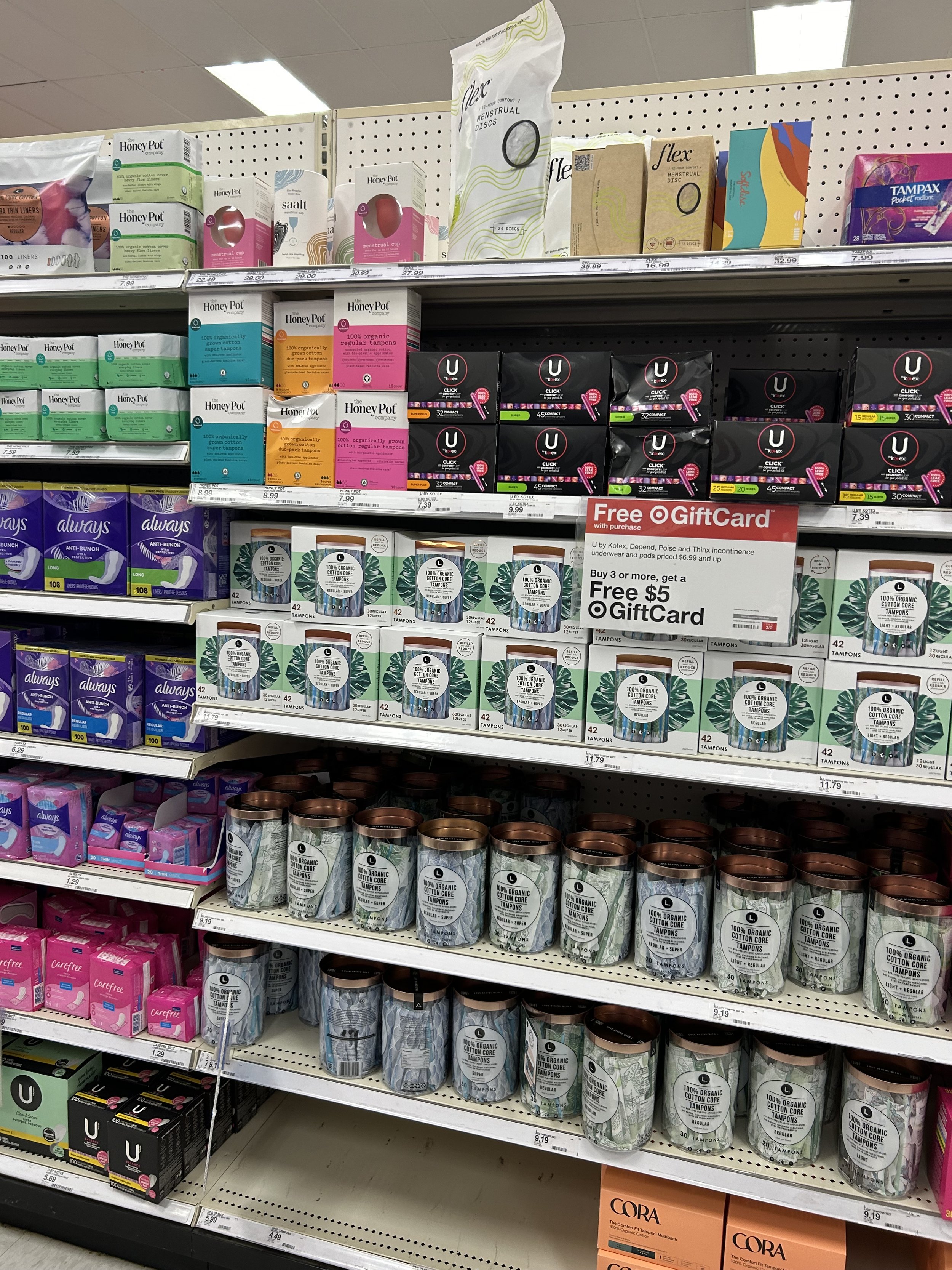
Observed that menstrual cups are always on top shelf, out of eye line.

Identified the most popular and accessible menstrual cup brands.

Analyzed color, imagery, messaging trends across all menstrual products.

Initial MoodBoard. Red & bold/make a statement vs. gender neutral & nature-inspired.


Packaging mock-ups & ideation.
Priority content categories: Good for you, your budget, and the planet.
Free from cost
Free from toxins
Free from worry
Plastic Free
Free Mother Nature
Content Organization


Branded the project as Freely, inspired by the feeling of lightness and openness.
Chose a bird motif to represent liberation and ease.
Brainstormed “free from...” language (toxins, worry, plastic) to build messaging.
Used warm, nature-inspired colors and wavy patterns to suggest softness and flow.
Concept Development
Design Execution
Created custom dielines and experimented with a curved lid to enhance shelf presence.
Illustrated vibrant sky scenes with a flying figure to draw attention and evoke optimism.
Added icon-based infographics (e.g., tampon equivalents, plastic waste) for quick education.


Printing and assembling process, alignment issues, color match adjustments.


A playful yet grounded brand identity that connects emotionally and visually with target users.
Package stands out in a retail environment through shape, color, and narrative.
Emphasized storytelling to normalize and demystify the product.
Outcome
I designed menstrual cup packaging that made the more eco-friendly and cost-effective alternative product more inviting through a more empowering and vibrant design.
I designed with the concept of female empowerment and freedom as the brand’s core values. The product naturally provided many freedoms: the user is free from the financial cost of their period, frees their body from plastic toxins, and helps free the planet from plastic waste.
Period products were often referred to as “feminine hygiene,” “sanitary,” and “women/girls health” products. Blood was blue and flowers were fresh, dainty, and poised. This discrete language and imagery, which often focused on cleanliness, stigmatized a human bodily function that half of the world’s population experienced by portraying periods as something that needed to be hidden. Yet, these products were sold to us as a “luxury,” not a “necessity.”
The stigma around periods was a major reason why people were dissuaded from trying menstrual cups. There was little to no empowering imagery or language used on period packaging displayed in a typical supermarket in the US. My target audience was anyone who menstruated and shopped for their period products in US supermarkets.
My goal for this design was to stand out and empower all people who menstruated by encouraging them to overcome the period stigma through an optimistic outlook on the many freedoms the product provided.