
Designing for a Cause
Inspired by years of volunteering with RAPTOR Inc. and a passion for conservation, I designed this mobile app prototype to support their mission of raptor rehabilitation, education, and conservation—making it easier for others to engage through a more intuitive, interactive experience.
Project Description


RAPTOR Inc.’s website is informative but hard to navigate. A streamlined, action-focused app could boost volunteer access and spark deeper public interest.
Design Problem
Process Work
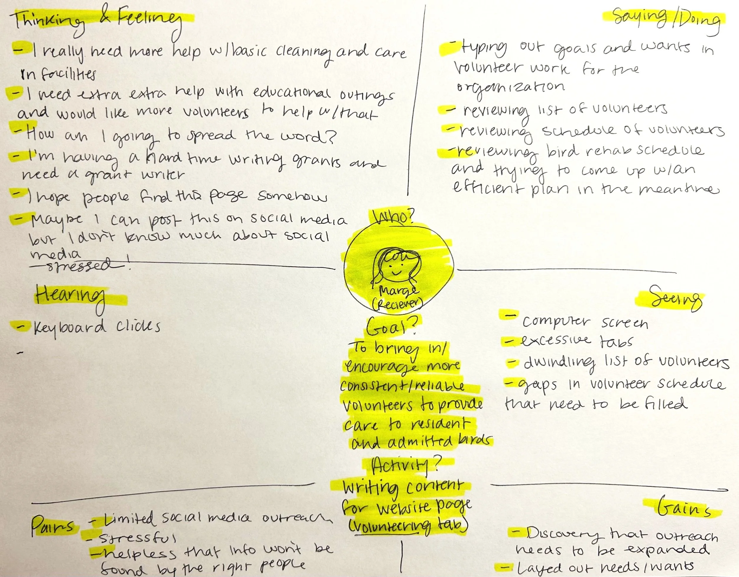

Reciever Empathy Map
Donor Empathy Map

Prospective volunteer persona.

Insider at RAPTOR Inc. persona—looking to improve outreach.


Analysis of RAPTOR Inc.’s existing design. Identifying navigational troubles and hierarchy of information.


Wireframe in Figma. Test! Test! Test! My classmates and professors tested my prototype every week and gave feedback.
Test it yourself!
Design Solution

Flow 1 - Volunteer engagement focused. Tracking tasks specific to their volunteer status.

Flow 2 - Outreach focused. Creating a personalized experience for those who are new to the organization through a quick quiz that introduces them to one of the resident ambassador birds.


Streamlined directory and home bar menu.
As one of my first high-fidelity Figma projects, this was a major learning experience. If I were to revisit it now, I’d simplify the interface—focusing on fewer screens, clearer navigation, and more consistent layouts. I’d plan the structure more intentionally, using components, variants, and flows from the beginning rather than having to figure them out mid-process. With a stronger grasp of visual hierarchy and feature prioritization, I’d streamline the design to feel more focused and user-friendly.