
Electric Root Festival Wayfinding
Collaborated with my Design Systems class to develop a graphic standards guide and wayfinding system for the Electric Root Festival in Oxford, Ohio, an annual event celebrating Black joy and radical hospitality. My team’s work was selected out of five, with direct input from the festival’s organizers and artists through client briefings, Q&As, and critiques.
Project Description
Assets
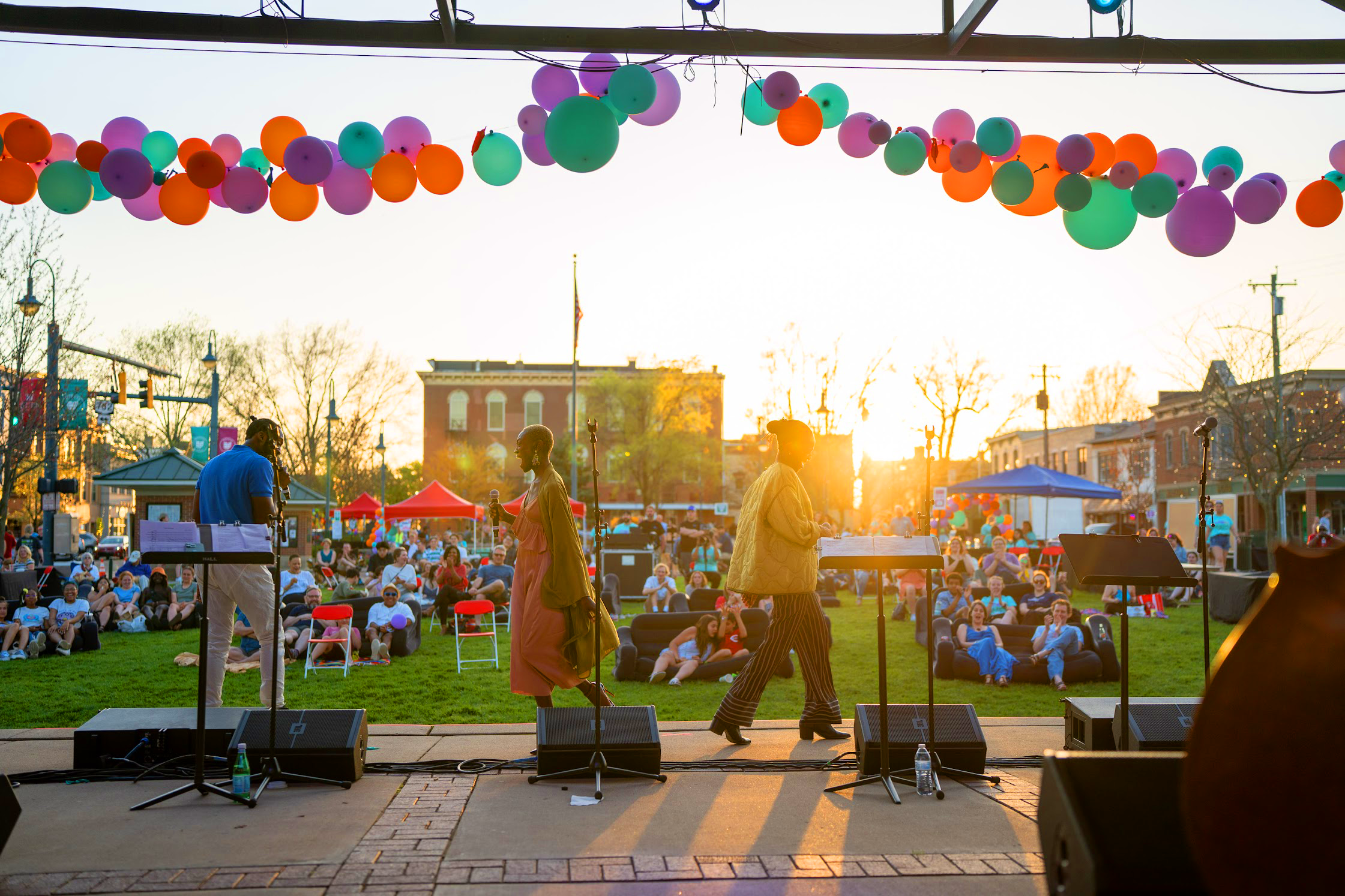
All photos from official Electric Root Festival website.


Existing Logo
Mood
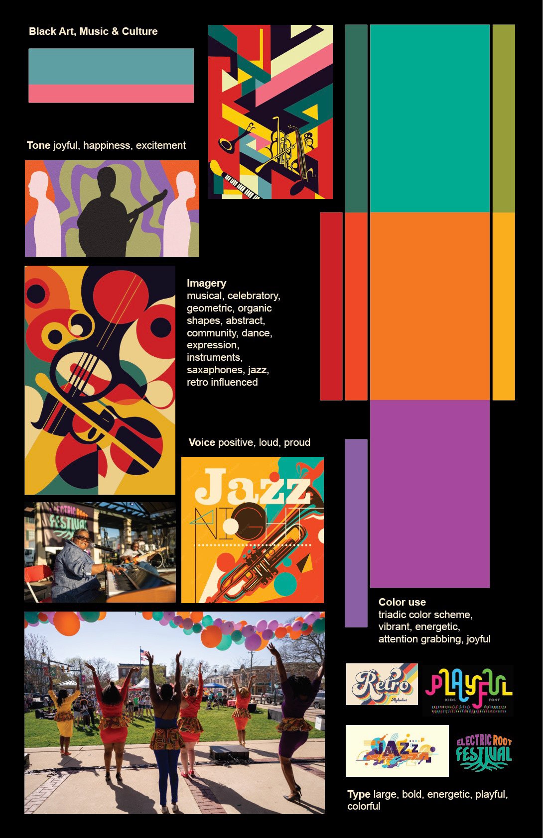

Through dialogue and iteration, this was my final graphic standards poster proposal to the class and the Electric Root Festival organizers. I aimed to highlight the themes of music and connection.
Graphic Standards
Graphic Standards Selected by Electric Roots Festival - Designed by Kayla Miller (classmate)
The Electric Root Festival organizers selected Kayla's graphic standards poster as the best representation of their brand identity. Her use of imagery of the people enjoying the festival truly expressed their values as an organization.
The typography, VTC Carrie in particular, was selected by our class from Vocal Type's website. The history behind the typeface reflects Electric Root's radical vision, just as Carrie Chapman Catt led the Women's Suffrage Movement in the US, which eventually led to women's right to vote.

Work in Small Design Teams
Team Members: Caitlin Curran, Rylee Blankenship, and Me
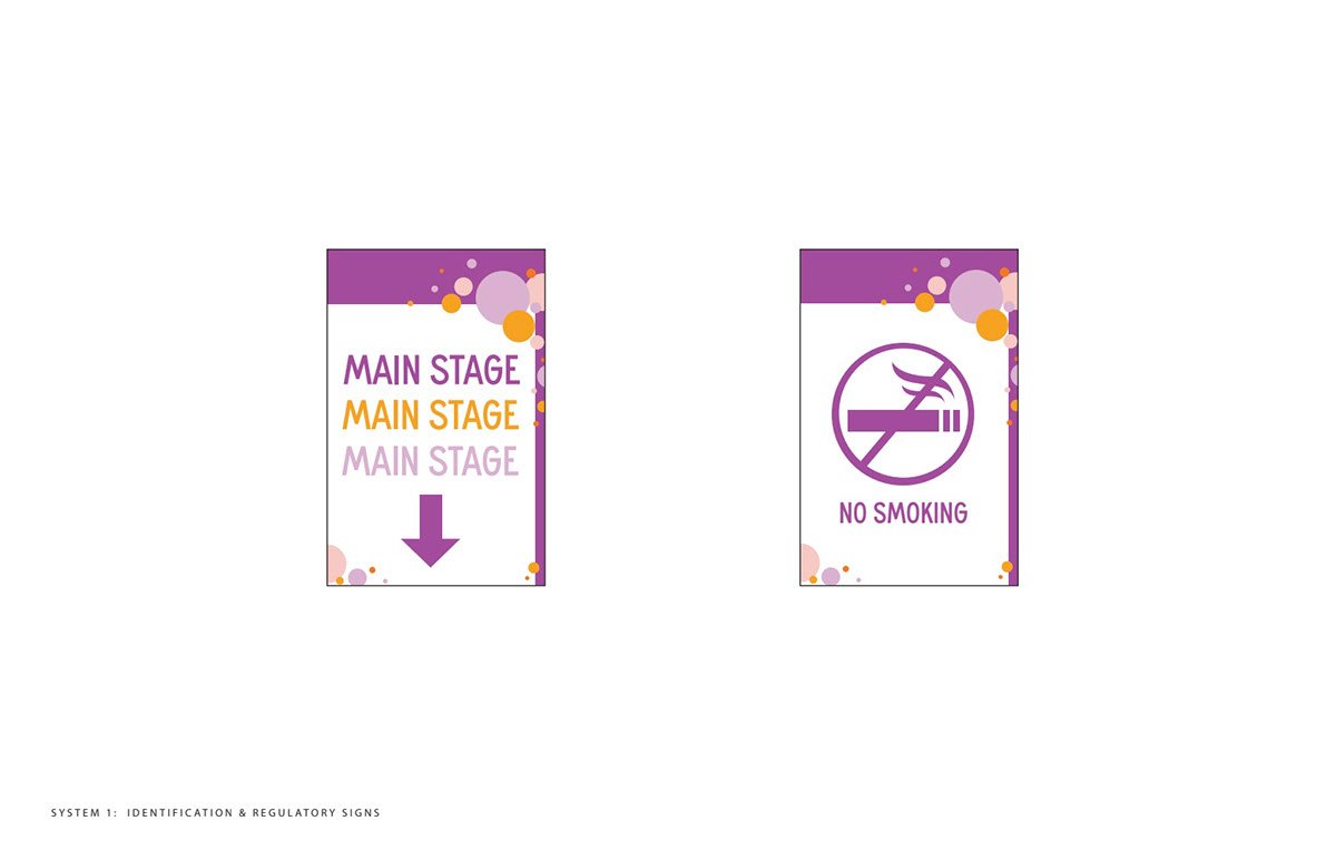
In assigned groups, we started using the graphic standards manual selected by Electric Roots to design the identification, regulatory, directional, and orientation signage individually first.

My digital roughs


Rylee’s digital roughs


Caitlin’s digital roughs
After a full class critique of our individual signage, we moved forward with applying that feedback to unify all of our designs into a cohesive whole.
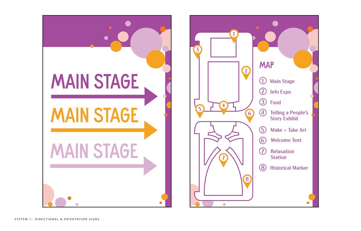
Small Design Team First Draft Critique

Presented a to-scale representation of the signage we designed together. We received valuable feedback from classmates and festival organizers on color contrast, iconography, and layout.
Rounded corners, frames, and the use of the vibrant orange were our core strengths.

Our teams proposed a usage guide for the signage. We identified which signs serve what purpose, mapped out where we think they will be most effective for festival goers, and defined rules for how they should be displayed.
Supplemental Usage Guide
Full class critique with Electric Root Festival Organizers and artists. They were impressed by the simplicity of our orientational map and the consistent iconography across all of the signage.
Small Design Team Final Proposal

Final Designs Chosen by Electric Roots for the Festival
Designed by: Caitlin Curran, Rylee Blankenship, and Me
11 x 17 Signage (Includes Identification & Regulatory Signage)


2 x 3 ft Signage (Includes Orientational, Directional, and Major Activity Signage)


Name Tag
Instagram Invitation
Button & Stickers (for festival goers at Welcome Tent)


Design in Use


